Kizzy Dankyi and Malakiya Phombeah-Savage
Truth –
More than half of adults in the UK skip brushing their teeth at least once a week.
Human Truth –
You can’t smell your own breath.
Idea –
You can’t smell your own breath but everyone else can.
Endline –
Catch your breath/Catch your breath before they do.
Branding
We incorporated the use of colours blue and white cohesively throughout as it reinforces the Oral-B branding. This style evokes feelings of cleanliness, freshness and hygiene as well as having known connotations with the healthcare industry. The colour blue also instils trust between the consumer and Oral-B but also enforces Oral-B’s commitment to improving oral health and building credibility.
Typically, Oral-B sways towards promoting their gum health and whitening products as well as their famous toothbrush appliances, however collaboratively each of us agreed that we should drive audiences to their freshening toothpaste due to the lack of publicity and potential virality that it has.
To direct away from Oral-B’s usual pristine image, the campaign features a less clinical/medical perspective and more of a witty and entertaining viewpoint. It still aligns with Oral-B’s tone of voice as it does not try to be necessarily bossy or too formal but rather promotes the brand’s messaging in a comedic and therefore inviting way.
This campaign aims to target young adults within generation Z (specifically 18-25 year olds) who may not stick to the advised teeth brushing routine or follow dental professionals’ advice.
What have we improved on since E1?
Upon reflection, in addition to tutor feedback, we realised that it was essential for us to find more inspiration. From that assessment we started to look at many different examples of great storytelling and execution on the D&AD website. This inspired our E2 work and submission, as we knew that to improve, we needed to work on our storytelling skills.
We also realised how important it is to make sure the idea is straightforward and easy to understand for audiences, especially making the copy legible, short and quick to understand. While the idea may be good, if it needs to be over-explained or analysed, it needs to be slightly reworked, and this is something we did during the process of completing this assignment. We also wanted to create a campaign that was more engaging whilst also staying on brand, and this is what we did with Oral-B.
Whilst we had a comedic spin on the campaign, we thought to keep Oral-B’s key messaging of education.
Poster Inspiration
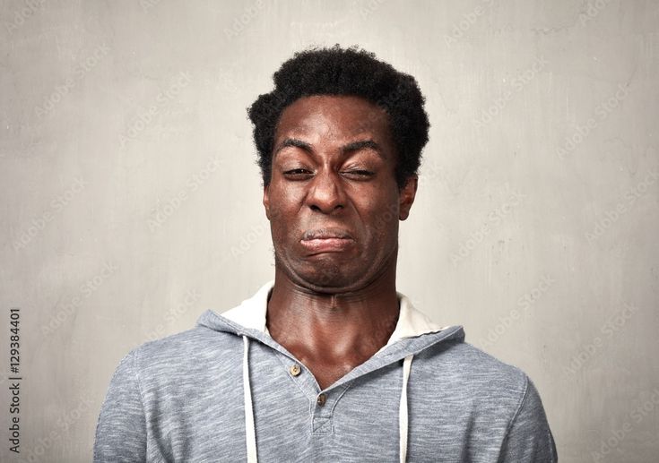
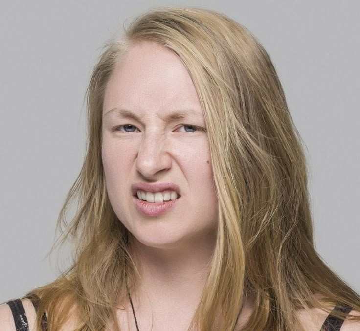
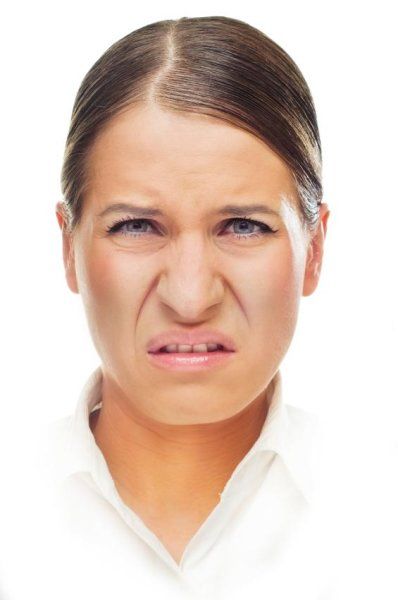
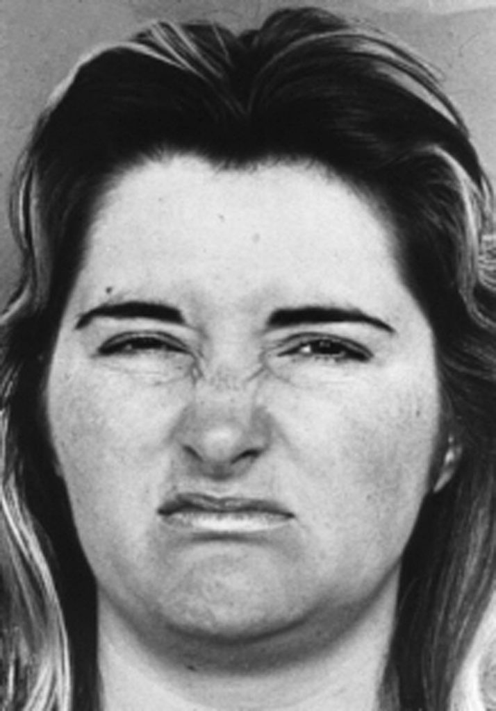
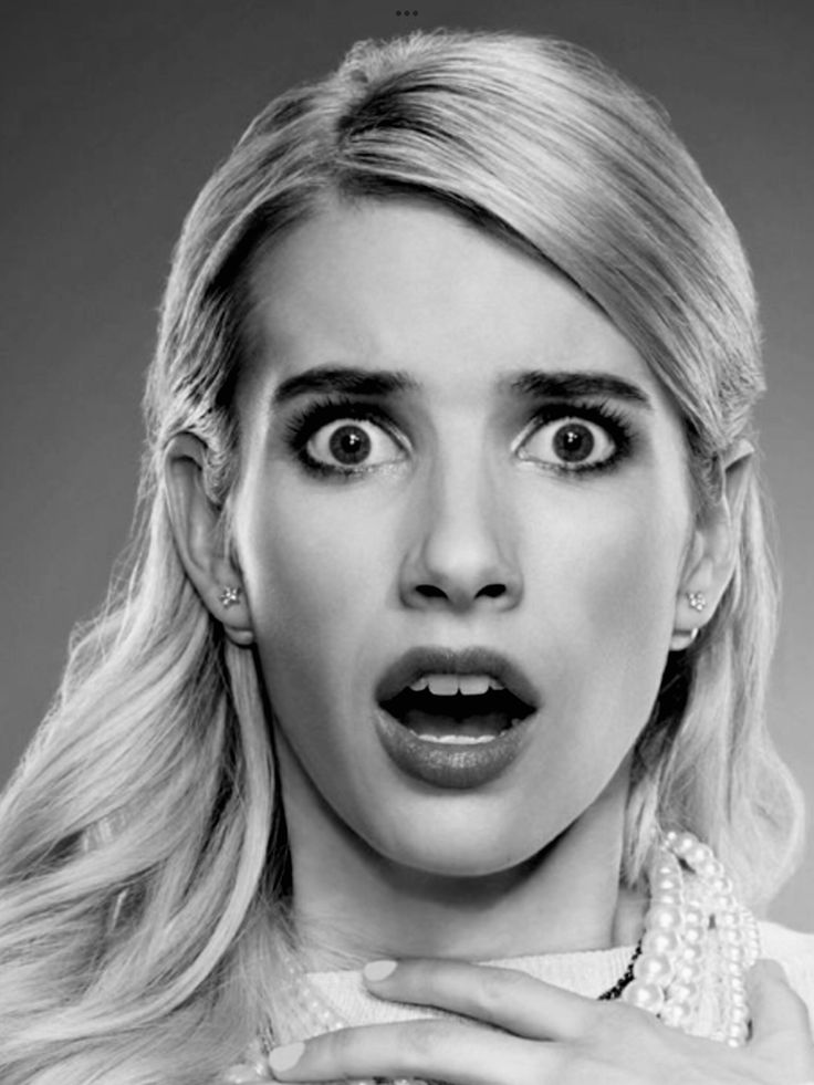
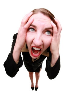
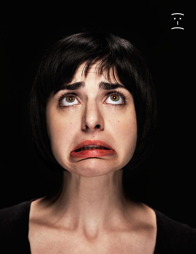
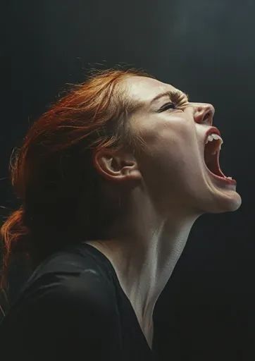
Here we have collated a few pictures that we used to inspire our work. We used Pinterest to search for “disgusted” and facial expressions to demonstrate the emotions that we wanted to convey consistently throughout the campaign.



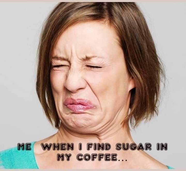
Posters
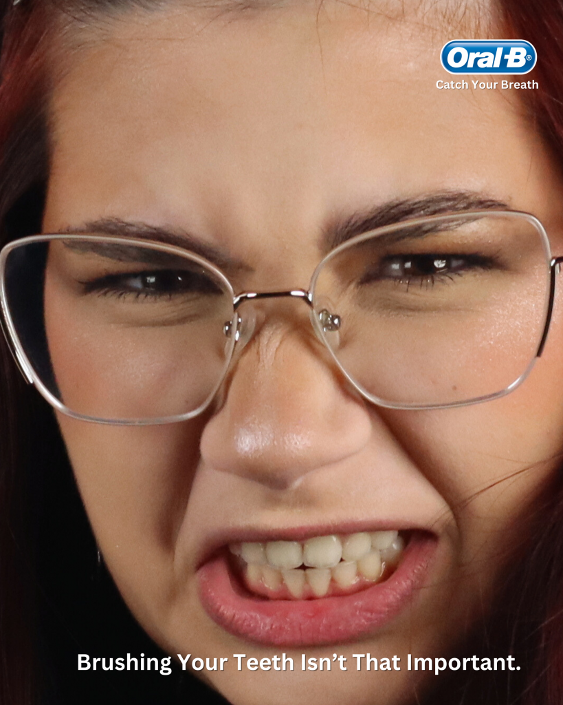
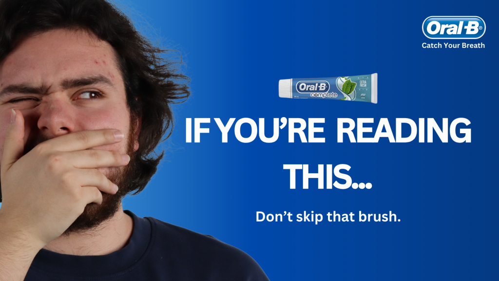
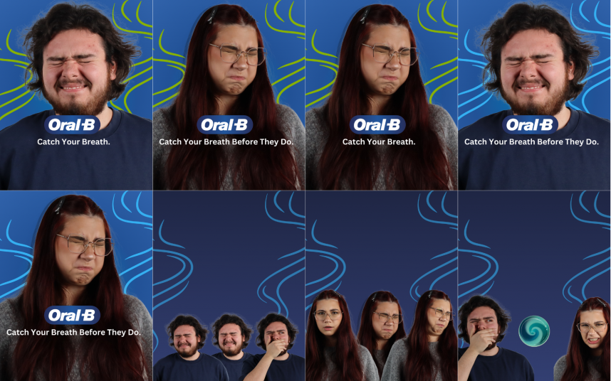
Firstly, we decided to create a mood board that would reflect the tone of voice and witty, humorous nature of the campaign. The imagery displayed above uses close-up shot facial expressions to indicate a direct mode of address to the target audience, calling out the viewer’s action of a common daily habit, implying they have skipped brushing their teeth. The use of direct eye contact throughout the campaign captures the viewer’s attention, allowing them to digest the content.
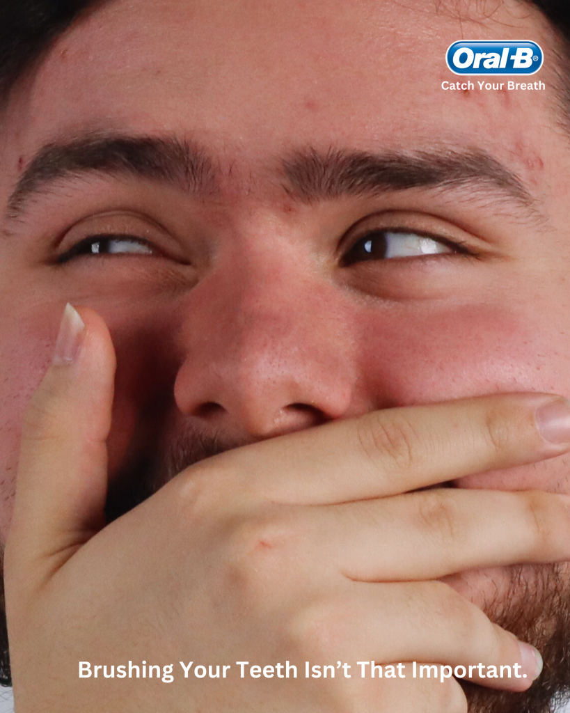
The posters that we have created feature two models making faces of disgust. We did our own photography for this assignment, as creating our own media was a goal that we set for ourselves going forward. The line at the bottom of the poster directly contrasts the face that the models are making, thus drawing back to the consequences of not brushing your teeth (your breath stinking and indicating poor hygiene). Enlisting the magic eraser and lasso tool, we created transparent PNGs from our images and then made gradient colour effects.
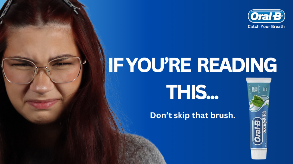
When looking back on our posters, we feel as if our posters were executed successfully and aligned with our vision. Based on our feedback, we wanted to get the “aha” moment, meaning that audiences immediately get it, and we think we have achieved that with the posters. They could be improved, however, with better copy, perhaps. The copy could be more witty/sharp or an Oral-B-related pun.
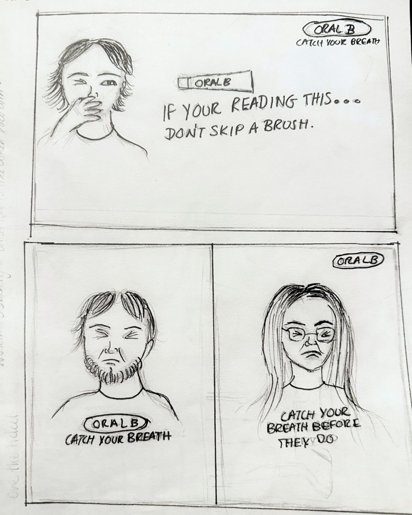
Poster Scamps
Non-Traditional/Experiential Ad

Covent Garden

Picadilly Circus
Trafalgar Square
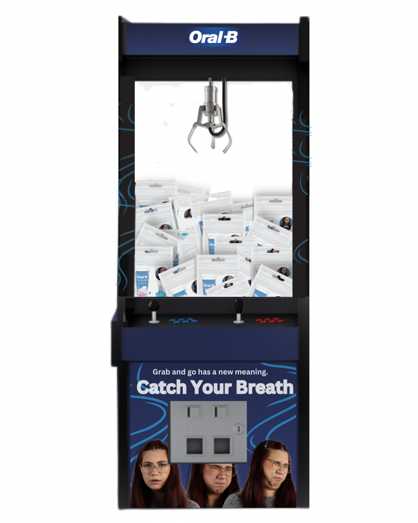

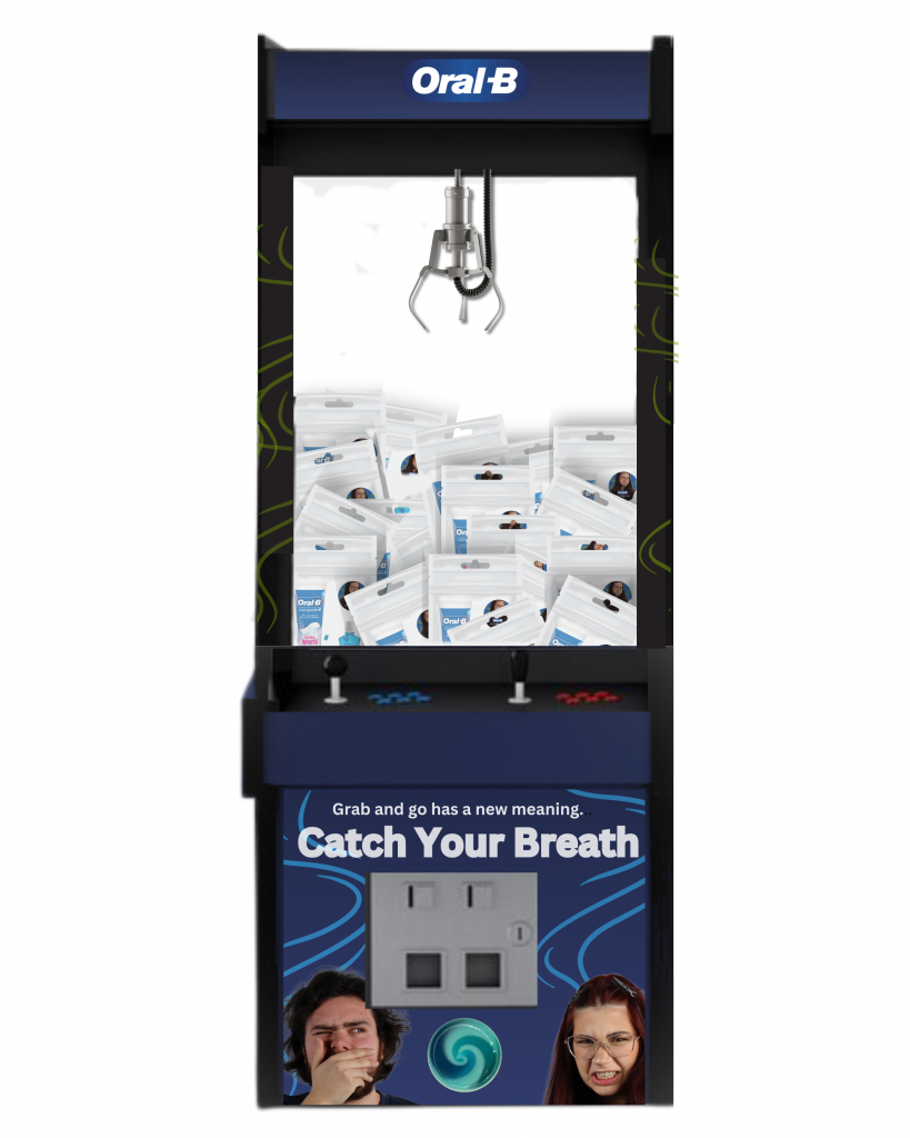
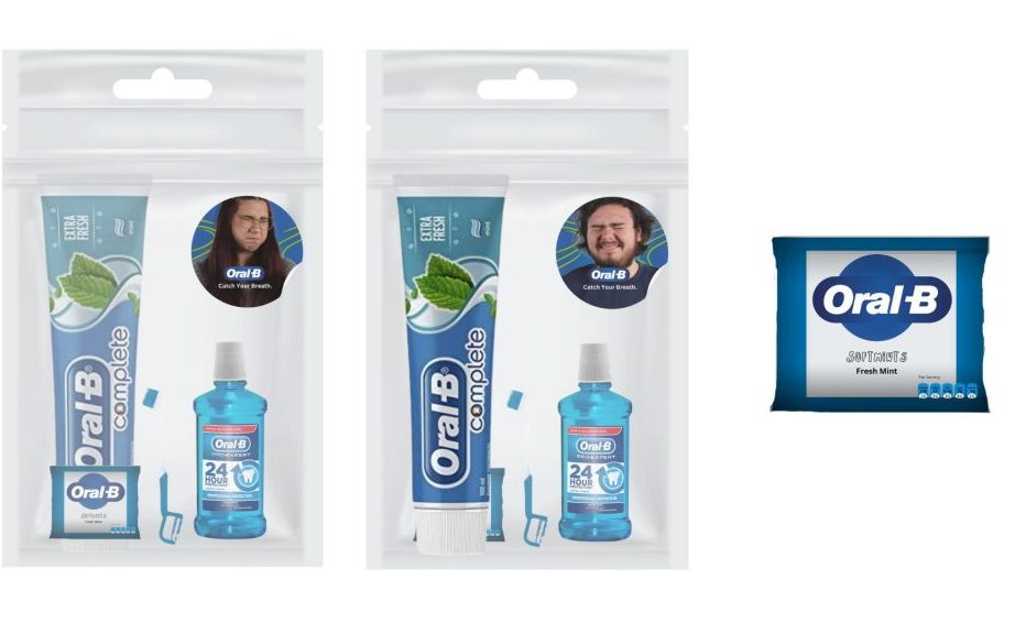
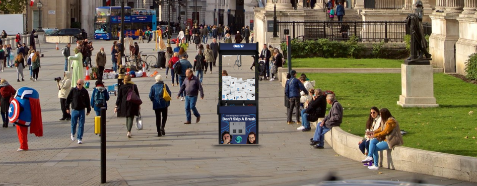
In order to create a dynamic and engaging form of ad, we designed an arcade-style claw machine, and by placing them in different locations in tourist hotspots such as Piccadilly Circus, we would drive a lot of attention to the ads. Using our two models/muses in all of the designs, we opted to create a blue-themed arcade/carnival-esque game reminiscent of Oral-B’s frequent usage of the colour blue. This is effective, as claw machines are a fun and engaging promotional tool leading to people repetitively visiting and playing. As well as this, the claw game showcases Oral-B’s products and entices people to try their products whilst also demonstrating their brand identity. Claw machines also create a sense of urgency, and this influences consumer behaviour, as consumers tend to act faster and value things they see as limited in time. Lastly, the machines can increase social media exposure through word-of-mouth marketing tools which encourage people to share pictures and videos on their own platforms.
This ad could have been taken further, though, for example, making it large scale to make it stand out more amongst the growing crowds.
Social Media
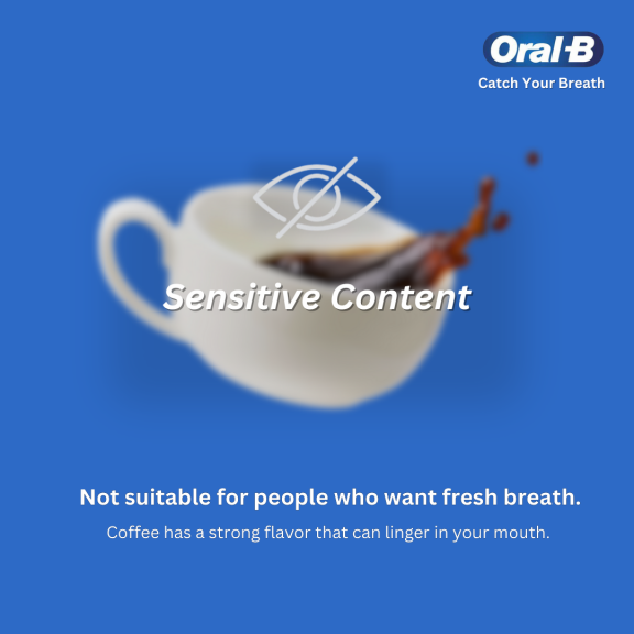
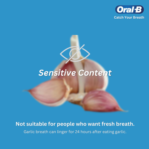
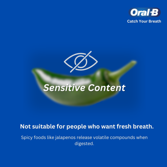
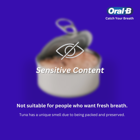
As for social media, we created a series of slides for an Instagram/Facebook post for the official Oral-B accounts, as well as a story post. Once we researched Oral-B’s social media, we found that they did not have much of an exciting presence online, and therefore we wanted to change that. By using the sensitive content blur, we are piquing the curiosity of the platform’s users, and by unveiling the blur, they are making a purposeful and conscious effort to see the content on the page. In regard to visuals, we chose to remain consistent with the colour blue but instead went for different variations of blue to make it more visually stimulating for audiences.
The use of the word “sensitive” within the copy coincides with the idea of the possible consequences of not taking care of your oral health, and an example of this would be sensitive teeth. We also took advantage of social media’s sensitive content filtering in a savvy way that promotes user interaction and engagement.
Although we could have improved our copy by making it more comical whilst being educational. By including some puns and jokes, we could have maximised the success of our campaign. The art direction, however, was a success due to the incorporation of known, stereotypical food and drink items that make your breath stink. Garlic is a notable example of this, as usually people know that garlic will give them potent breath, as well as coffee.
TV Ad Inspiration


TV Ad
Focusing on medium close ups, dolly and zoom-ins added a comedic flare to the ad but also helped to differentiate between moments of inner thoughts and out loud dialogue.
We chose to film in the studio in order to experiment with equipment and lighting. Three point lighting ensured that no shadows appeared in shots. This reflected the clean and pristine essence of Oral-B ads which mostly have a clinical nature. The ad also showcased the product but also had the element of storytelling with a relatable scenario.
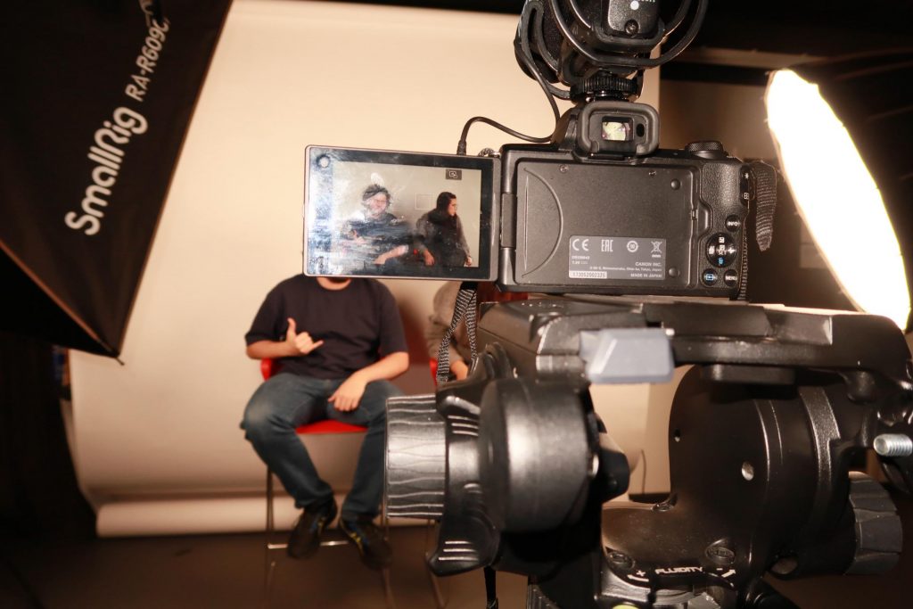
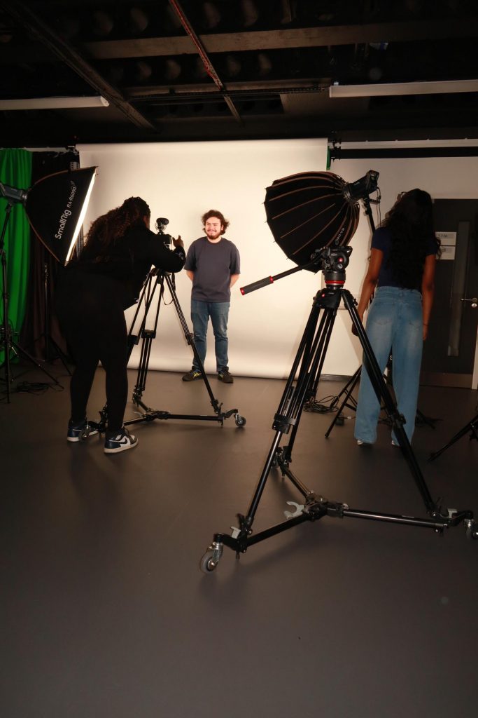
Focusing on medium close ups, dolly and zoom-ins added a comedic flare to the ad but also helped to differentiate between moments of inner thoughts and speech out loud dialogue. We chose to film in the studio in order to experiment with equipment and lighting. To enhance our storyline we used effects in both our audio and TV ads to move it along. For video effects, we used a fisheye video effect and fade in/out. The dramatic horn sound is used here to disrupt the scene and indicate bad breath. 3 point lighting also ensured that no shadows appeared in shots.
Initially we struggled with generating a concept for the TV ad due to working under limited time conditions but we managed to produce a piece of work similar to Oral-B’s simplistic and minimalist ads whilst also bringing a humorous element to it. We filmed and recorded our radio and TV ads on the same day so we learnt about how important it is to manage your time constructively.
In terms of improvements the TV ad could be refined through more experimentation with out of studio scenery. A bathroom, for example, or a location setting such as a park would have assisted with the overall storytelling. Despite this, we were still able to effectively communicate our intended message for the campaign and reach our desired target audience.
Radio Ad
Our radio ad draws upon the many first date horror stories that many people have. Through the use of diegetic sound such as dialogue and the built up ambience noise of the hustle and bustle of a restaurant which consists of footsteps, people in the background talking, chairs scooting, knives and forks scraping against plates and the sound of smooth jazz music playing. The use of these sound effects implicate the scenery, suggesting to the audience that it is a date night scene. This is important as this is an audio only ad so audiences must be able to visually imagine what is going on without being confused.
By utilising copyright free music and sound effects from Pixabay to create a soundscape our script came to life. We recorded this using the sound booth facilities to get a crisp and professional sounding ad.
After recording we found that the volume levels were quite low so utilising Adobe Audition we amplified the voices as well as took out any dead air so that the conversation between our characters would flow. We ensured that the audio levels were not above the red levels and that the pitch was balanced. A lot of the language in our script was quite breathy and this meant that there was a lot of popping during recording due to the sensitivities of the mics.
If we were to improve we would have had more practice with our two actors so that they were more prepared. As we were constrained by time there was not enough rehearsal time but next time we will ensure we have enough time so that our actors are more expressive. In addition, we would also make sure the levels are high enough so that we do not experience low audios.
As for storytelling, it was a hard concept to communicate through audio and to get audiences to instantly process it. We could have done a script similar to our TV ad which perhaps would have been simpler and allowed for a more through and cohesive campaign.
Leave a Reply